
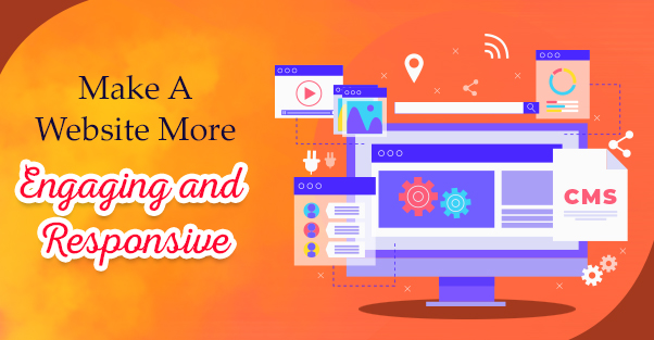
A website is an efficient tool to reach out to a thousand / millions of customers online. Only a website with a good design can retain visitors. Further, it will facilitate to convert them into reliable customers.
You need to keep in mind certain aspects if you are looking to make an engaging website. We would be discussing the about in this blog.
Check the following points:-
- Try to keep the design simple & easy
- Easy & fast navigational features
- Use a clear call to action
- With content, less is more
- Use properly white space
- Use the colors in the eye-catching colors
- Fonts used should be Attractive and Easy to Read
- Engage users with Videos & images
- Make a responsive & mobile-friendly website
- Break content up with section headers
Try to keep the Design Simple & Easy
Limit the utilization of fonts, colors, and animated gifs, which can distract and pull the eyes away from the web page’s focus. Short paragraphs and bullet points also create information a lot of scannable and likely to be read.
Easy & Fast navigational features
If you are looking to create an engaging make, then fast & easy navigational features should be present. You do not want your traffic & visitors to waste their time looking out for navigational features. If they spend a lot more time getting the information, then navigational features should be redesigned. Further, navigational button menus should be directly visible to the users. In this way, they would feel a lot more accessible and comfortable.
Use a clear call to action
Call to action plays a vital role as they invite the users/customers for taking steps. For example, a call to action button would sign up for an email, newsletter or buy any products/services.
It would be best if you create & design these buttons to stand out from the ease of the elements. Other than this, try to keep the text on the call to action (CTAs) short.
With content, less is more
People/users crouch to avoid visiting websites that have a lot of text-based content. Hence, web pages should have the right mix of text, relevant images, videos, and visual content. Also, remove & delete any product displays & ads that are undesirable. Try to create a clutter-free web page having text and visual elements.
Used Properly White Space
Whitespace is a vital design element for creating aesthetically stunning websites. In this method, an experienced website designer lets a lot of space remain empty on web pages. This space does not contain any image or text. The intention behind this is to better the readability of the text. Other than this, White space is also an excellent way to relieve the eyes of the stress when reading a web page. With a lot of space left blank, users can quickly & fastly scan the information through the page. This helps in retaining the users on the website and reduces the bounce rate.
Use the colors in the eye-catching colors
Make sure that the right color that you select for your website is eye-catchy of users. But the color should be chosen strategically such that it can convey the message of your company’s brand.
On a website, you will find several imperative buttons & interface elements. Thus, select a contrasting color for the same to catch the attention of the user.
Lastly, selecting the right & good color palette holds paramount importance if you create an engaging website.
Fonts used should be Attractive and Easy to Read
Use a clean typeface and assist in reading the data & information. Such a typeface should be visible and unique. This will help in reading website text clearly & understandable. Find out which fonts are trending and see if they are matched with your company brand personality.
Engage users with Videos & Images
Another helpful feature of an engaging & responsive website design is its relevant & Suitable images and videos. These crucial visual elements can keep the visitors retained on the website.
It also assists in reducing the bounce rate. But make sure that there is a good & right mix of text and visual content. Both of them should complement each other. In many cases, there has been an increase in a website’s unique users.
Make a responsive & mobile-friendly website
Most of the web searches are made on smartphones. So, there is a great huge chance that your target customers would be looking out for services or products using mobile devices.
This probably means that the website design should be responsive to the screens of a small phone. The website design should be made in such a way that users, visitors can comfortably search for your organization.
Break content up with section headers
Users can easily & quickly scan such content. Always try to keep a header, even if it is a product description. Break down your header text content into small chunks so that visitors can go through it quickly. In this way, you would be able to create an engaging & responsive website.